Aldi
Chelmsford
Case Study & Signage Inspiration

The Brief.
About the client.
Aldi Chelmsford has asked Signs Base to help them improve the interior decor of staff canteens, offices, training rooms and corridor walls. The main objective was to transform the areas into more collaborative and staff friendly spaces as well as portray all the brand values.
The Project
Signs Base has submitted the project proposal with the design concept, scope of works and project timeline which after adjustments has been accepted.
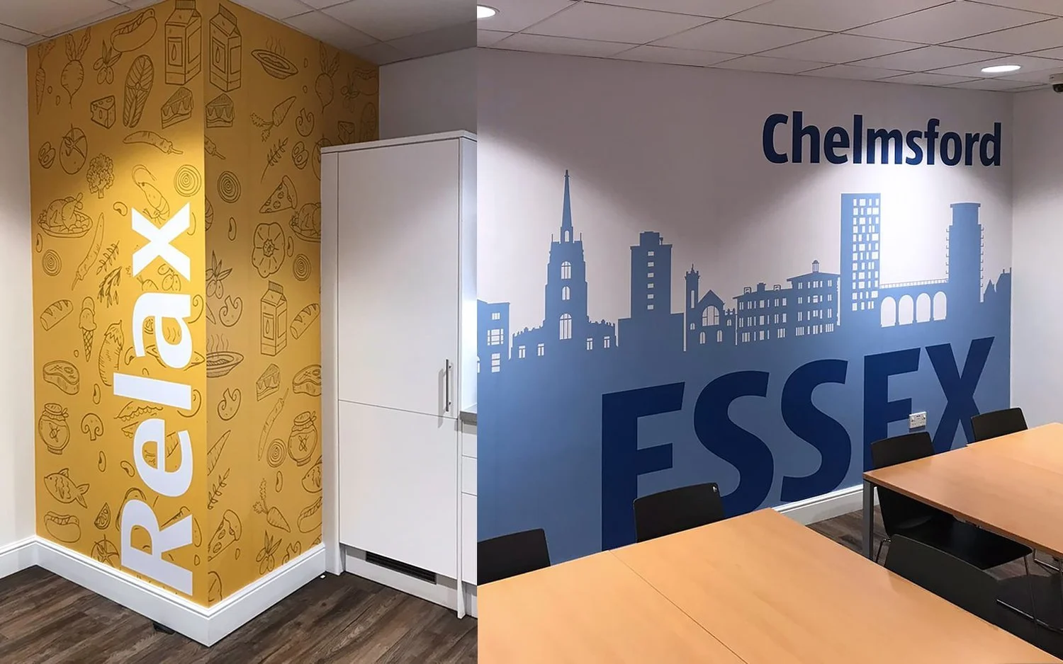
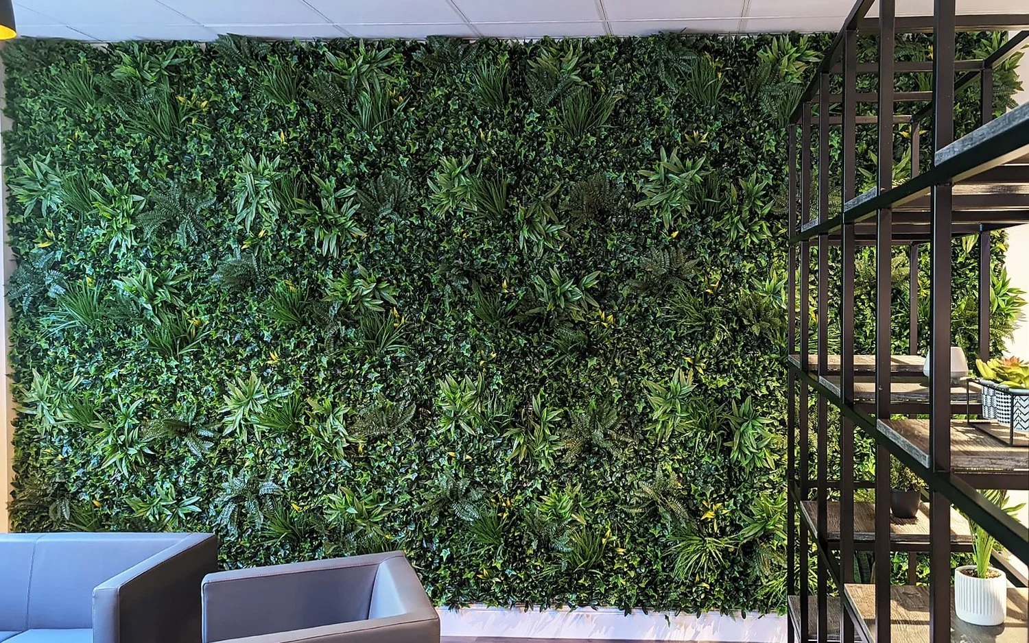
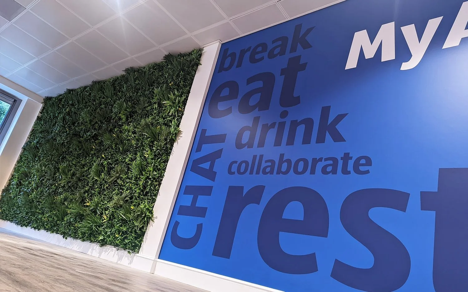
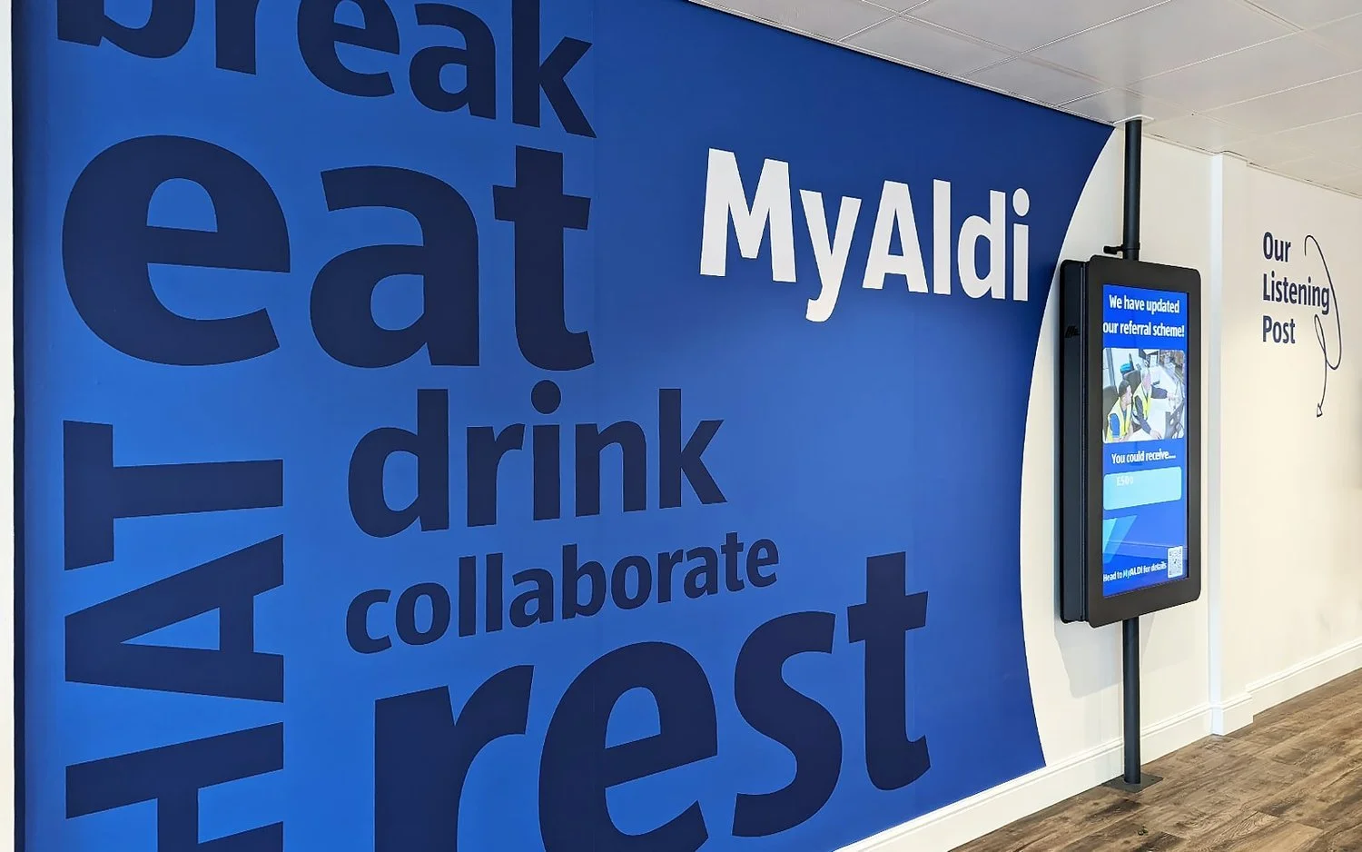
The walls in the main staff canteen were divided into two sections. The left part of the space has been transformed into a designated rest area with soft seating furniture and an artificial plant wall. The other side of the wall has been applied with digitally printed wall graphics. Similar wall graphics have been applied within the smaller staff canteens located on the other side of the warehouse.
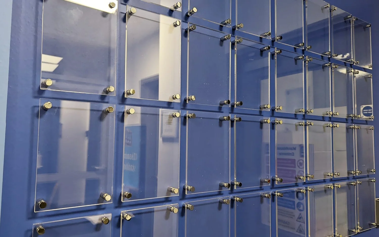
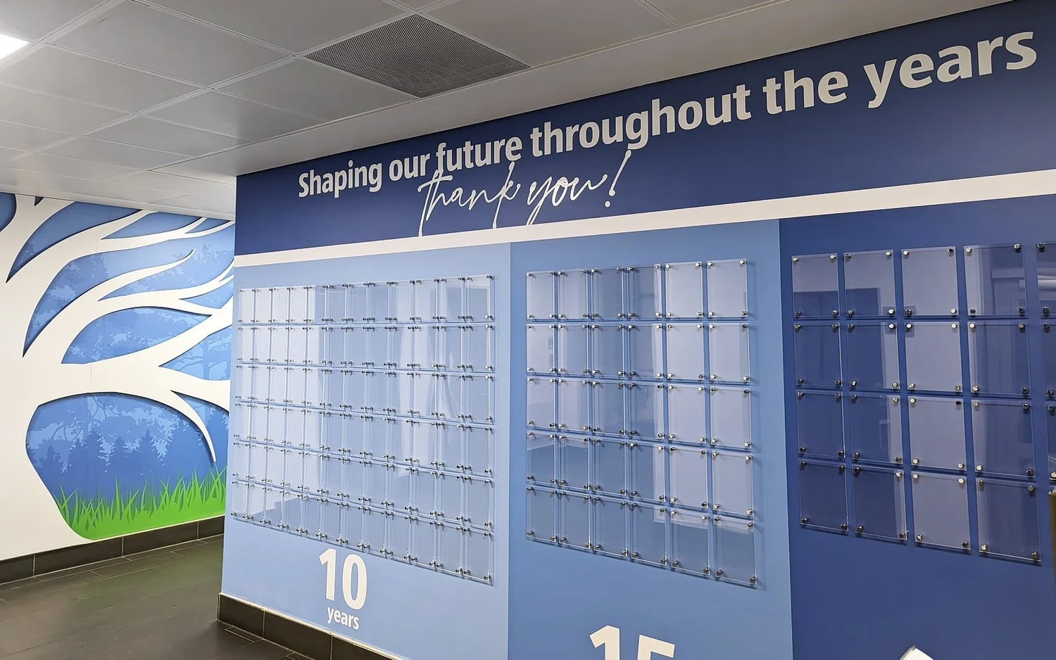
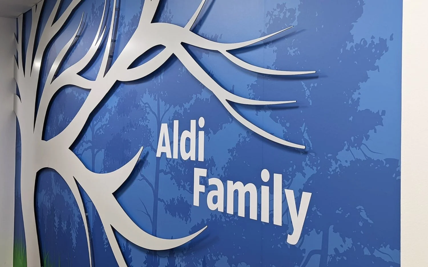
The main corridor outside the staff canteen was covered in digital wall graphics with magnetic elements such as a shaped tree mounted on studs, to enable applying photos of staff members with ease. Over 100 acrylic holders on locators have been installed on the "Long Service" wall, just opposite the magnetic tree.
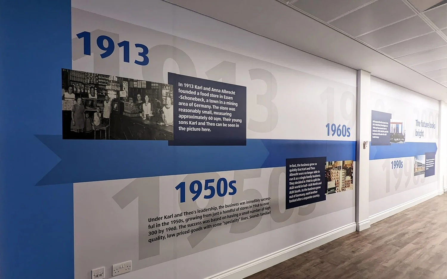
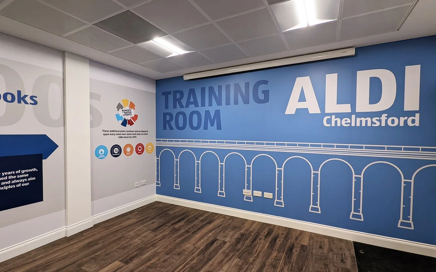
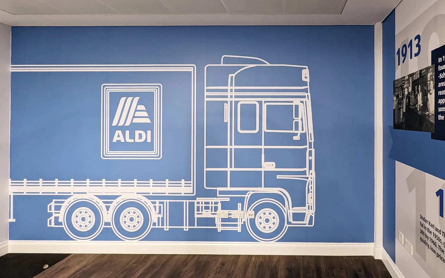
The timeline portraying company history was printed and installed inside the training room along with two other artworks incorporating Aldi truck and local landmarks such as Chelmsford Viaduct. A similar concept was used in the smaller staff canteen.
The project was completed within 7 days and was carried out by 4 fitters.
Like what
you see?


